この記事はアフィリエイトリンクを使用しています。

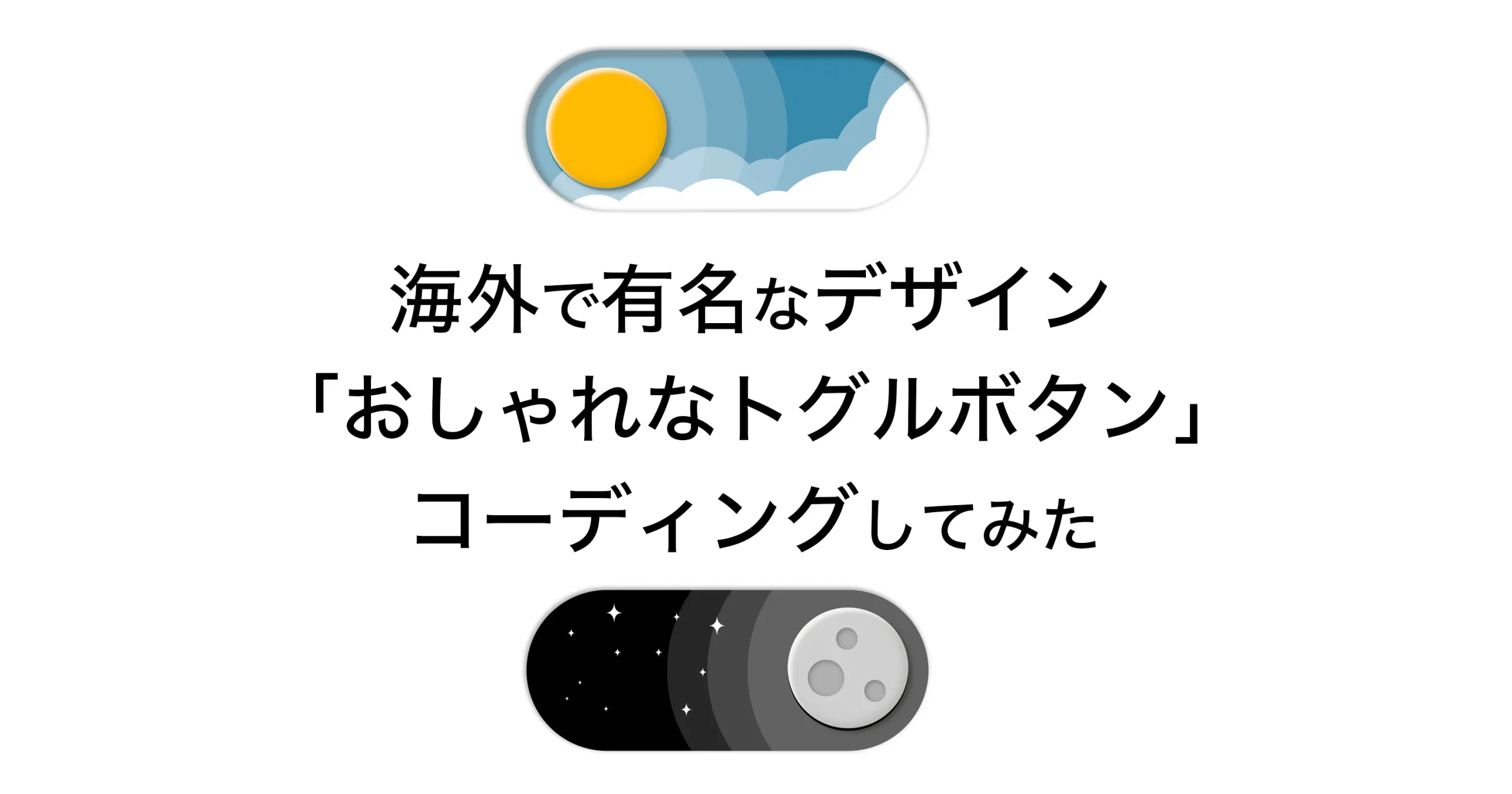
FigmaのXアカウントがおしゃれなトグルボタンを公開していて、「コーディング泣かせだ」との声を見かけたので、改めて自分でコーディングしてみようと思い書いてみました。
デザイナに作れよ!って言われれば作るよ。だってぷろだもん。https://t.co/HF6afHhfzm https://t.co/IXl7iufv7v pic.twitter.com/T4x4uV7tKX
— ゆひゃ (@zaty_Akiyama) October 14, 2023
元ネタ
参考にしたのはFigmaのこのポストですが、結構有名なデザインで、最初に見たのはこのポストだと思います。
still laughing at this pic.twitter.com/Ny525aAuYH
— Joie Chung (@hellojoie) April 28, 2023
このポストの一連の引用や返信を見ると、海外でもっと綺麗にコーディングした方がいることを念頭に伝えておきます。
コーディングにあたって
実際2層の雲の間に太陽の影があったり、ボタンにマウスオーバーアニメーションがついていますが、クリック時には一度マウスオーバー判定を解除しないといけない部分が大変ポイントかなって思います。
個人的にトグルボタン程度でJSを書きたくないので、HTMLとCSSだけでコーディングしてみるか。という考えでコーディング始めました。
また、ボタンはPCとスマートフォンで大きさを変更させることがよくありますので、font-sizeを変更することで、ボタン自体の大きさを変動できるように、em単位を使ってコーディングしていきます。
HTML
<input type="checkbox" id="weatherCheckboxInput">
  <div class="weather-checkbox">
    <div class="weather-checkbox__wrap">
      <div class="weather-checkbox__night">
        <svg xmlns="http://www.w3.org/2000/svg"  class="weather-checkbox__star" viewBox="0 0 200 200">
          <path d="M 100 0 Q 100 90 200 100 Q 100 100 100 200 Q 90 100 0 100 Q 90 90 100 0" fill="#FFF"/>
          <path d="M 100 0 Q 100 90 200 100 Q 100 100 100 200 Q 90 100 0 100 Q 90 90 100 0" fill="#FFF"/>
          <path d="M 100 0 Q 100 90 200 100 Q 100 100 100 200 Q 90 100 0 100 Q 90 90 100 0" fill="#FFF"/>
          <path d="M 100 0 Q 100 90 200 100 Q 100 100 100 200 Q 90 100 0 100 Q 90 90 100 0" fill="#FFF"/>
          <path d="M 100 0 Q 100 90 200 100 Q 100 100 100 200 Q 90 100 0 100 Q 90 90 100 0" fill="#FFF"/>
          <path d="M 100 0 Q 100 90 200 100 Q 100 100 100 200 Q 90 100 0 100 Q 90 90 100 0" fill="#FFF"/>
          <path d="M 100 0 Q 100 90 200 100 Q 100 100 100 200 Q 90 100 0 100 Q 90 90 100 0" fill="#FFF"/>
          <path d="M 100 0 Q 100 90 200 100 Q 100 100 100 200 Q 90 100 0 100 Q 90 90 100 0" fill="#FFF"/>
          <path d="M 100 0 Q 100 90 200 100 Q 100 100 100 200 Q 90 100 0 100 Q 90 90 100 0" fill="#FFF"/>
          <path d="M 100 0 Q 100 90 200 100 Q 100 100 100 200 Q 90 100 0 100 Q 90 90 100 0" fill="#FFF"/>
          <path d="M 100 0 Q 100 90 200 100 Q 100 100 100 200 Q 90 100 0 100 Q 90 90 100 0" fill="#FFF"/>
        </svg>
      </div>
      <div class="weather-checkbox__cloud-back"></div>
      <label class="weather-checkbox__button" for="weatherCheckboxInput">
        <div class="weather-checkbox__moon">
          <div class="weather-checkbox__moon-crater"></div>
        </div>
      </label>
      <div class="weather-checkbox__sun-shadow"></div>
      <div class="weather-checkbox__cloud-front"></div>
      <div class="weather-checkbox__shadow"></div>
    </div>
</div><label>をクリックすることで、<input>が:checkedになるので、CSSセレクタを使ってオンオフを制御します。
星のデザインは動作が一定なので、もっと単純に書けると思いますが、取り急ぎの実装だったので自前で星っぽいデザインを用意して11個分コピペしました。
できればHTMLを汚したくはないので、雲の部分は影の部分はCSSのbox-shadowでコピーしていくことで対応しようと思います。
SCSS
@keyframes easingAni {
  0%, 99% {
    pointer-events: none;
  }
  100% {
    pointer-events: auto;
  }
}
@keyframes easingBack {
  0%, 99% {
    pointer-events: none;
  }
  100% {
    pointer-events: auto;
  }
}
.weather-checkbox {
  display: block;
  font-size: 320px;
  width: 1em;
  aspect-ratio: 5 / 2;
  position: relative;
  border-radius: 100vw;
  background-color: rgb(53, 137, 171);
  box-shadow:  -1px -1px 3px 1px rgba(#000, .3),
                2px 2px 8px 0px rgba(#FFF, .8);
  transition: .6s background-color ease-in-out;
  &__button {
    height: calc(100% - 32px);
    aspect-ratio: 1;
    background-color: #ffbb00;
    position: absolute;
    top: 14px;
    left: 16px;
    border-radius: 50%;
    box-shadow: 3px 3px 3px 0px rgba(#FFF, .8) inset,
                -2px -2px 8px 0px rgba(#000, .16) inset,
                .01em .01em .01em rgba(#000, .3);
    transition: .6s left ease-in-out, .6s transform ease-in-out;
    z-index: 5;
    overflow: hidden;
    cursor: pointer;
    animation: easingAni 1s ease-in-out forwards;
    &:hover {
      transition: .4s left ease-in-out, .4s transform ease-in-out;
      left: 24px;
      & + .weather-checkbox__sun-shadow {
        transition: .4s left ease-in-out, .4s transform ease-in-out;
        left: 24px;
      }
    }
  }
  &__moon {
    width: 100%;
    aspect-ratio: 1;
    position: absolute;
    top: 0;
    left: 0;
    background-color: #D0D0D0;
    border-radius: 50%;
    box-shadow: 3px 3px 3px 0px rgba(#FFF, .8) inset,
                -2px -2px 8px 0px rgba(#000, .16) inset;
    transform: translateX(120%);
    transition: .6s transform ease-in-out;
    &-crater {
      width: 30%;
      aspect-ratio: 1;
      position: absolute;
      top: 0.13em;
      left: 0.05em;
      background-color: #B0B0B0;
      border-radius: 50%;
      box-shadow: 1px 1px 4px 0 rgba(#000, .3) inset;
      &::before, &::after {
        content: "";
        width: 60%;
        aspect-ratio: 1;
        position: absolute;
        top: -0.08em;
        left: 0.07em;
        background-color: #B0B0B0;
        border-radius: 50%;
        box-shadow: 1px 1px 4px 0 rgba(#000, .3) inset;
      }
      &::after {
        top: 0.05em;
        left: 0.14em;
      }
    }
  }
  &__sun-shadow {
    height: calc(100% - 32px);
    aspect-ratio: 1;
    position: absolute;
    top: 16px;
    left: 16px;
    border-radius: 50%;
    box-shadow: -.1em 0 0 .2em rgba(255,255,255, .15),
                0 0 0 .2em rgba(255,255,255, .15),
                .1em 0 0 .2em rgba(255,255,255, .15);
    transition: .6s left ease-in-out, .6s transform ease-in-out, .6s box-shadow ease-in-out;
    z-index: 3;
  }
  &__wrap {
    overflow: hidden;
  }
  &__wrap, &__shadow, &__night {
    width: 100%;
    height: 100%;
    position: absolute;
    top: 0;
    left: 0;
    border-radius: 50vw;
  }
  &__shadow {
    pointer-events: none;
    box-shadow: 3px 3px 3px 3px rgba(#000, .4) inset;
    z-index: 2;
  }
  &__cloud-front, &__cloud-back {
    width: .15em;
    aspect-ratio: 1;
    color: #FFF;
    background-color: currentColor;
    position: absolute;
    right: .0;
    bottom: .0;
    border-radius: 50%;
    z-index: 1;
    transition: .6s transform ease-in-out;
    box-shadow: .12em -.1em 0 .1em currentColor,
                .03em .05em 0 .1em currentColor,
                -.15em .15em 0 .1em currentColor,
                -.3em .12em 0 .02em currentColor,
                -.45em .13em 0 .06em currentColor,
                -.6em .15em 0 .06em currentColor,
                -.75em .14em 0 .03em currentColor;
  }
  &__cloud-back {
    opacity: .4;
    right: .02em;
    bottom: .08em;
    z-index: 0;
  }
  &__night {
    transform: translateY(-250%);
    transition: .6s transform ease-in-out;
  }
  &__star{
    display: block;
    position: absolute;
    top: 0px;
    left: 0;
    transform-origin: top left;
    transform: scale(.05) scaleX(.8);
    overflow: visible;
    width: 100%;
    path:nth-of-type(1) {
      transform: translate(7.1em, 0.8em);
    }
    path:nth-of-type(2) {
      transform: translate(6.7em, 2.4em)scale(.5);
    }
    path:nth-of-type(3) {
      transform: translate(5.7em, .7em) scale(.45);
    }
    path:nth-of-type(4) {
      transform: translate(5em, 1.8em)scale(.45);
    }
    path:nth-of-type(5) {
      transform: translate(6em, 3.5em)scale(.7);
    }
    path:nth-of-type(6) {
      transform: translate(3.1em, .4em);
    }
    path:nth-of-type(7) {
      transform: translate(1.6em, 1.2em)scale(.45);
    }
    path:nth-of-type(8) {
      transform: translate(3.4em, 1.8em)scale(.45);
    }
    path:nth-of-type(9) {
      transform: translate(2em, 2.8em)scale(.25);
    }
    path:nth-of-type(10) {
      transform: translate(1.5em, 3.3em)scale(.24);
    }
    path:nth-of-type(11) {
      transform: translate(3em, 3.6em)scale(.3);
    }
  }
}
#weatherCheckboxInput {
  visibility: hidden;
  position: absolute;
  top: 0;
  left: 0;
  &:checked + .weather-checkbox {
    background-color: #000;
    .weather-checkbox {
      &__button {
        left: calc(100% - 16px);
        transform: translateX(-100%);
        animation: easingBack 1s ease-in-out forwards;
        &:hover {
          transition: .4s left ease-in-out, .4s transform ease-in-out;
          left: calc(100% - 24px);
          transform: translateX(-100%);
          & + .weather-checkbox__sun-shadow {
            transition: .4s left ease-in-out, .4s transform ease-in-out;
            left: calc(100% - 24px);
            transform: translateX(-100%);
            }
        }
      }
      &__sun-shadow {
        left: calc(100% - 16px);
        transform: translateX(-100%);
        box-shadow: .1em 0 0 .2em rgba(255,255,255, .15),
                    0 0 0 .2em rgba(255,255,255, .15),
                    -.1em 0 0 .2em rgba(255,255,255, .15);
      }
      &__cloud-front, &__cloud-back {
        transform: translateY(250%);
      }
      &__night {
        transform: translateY(0);
      }
      &__moon {
        transform: translateX(0);
      }
    }
  }
}
クラスの規則は慣れたBEMベースで書いたので、SCSSで書きました。
こだわりポイントは、クリックされると@keyframesのアニメーションが機能してマウスオーバー判定を解除した部分です。
ボタンに外影がついているので、overflow: hiddenと共存させるためにwrapという要素が必要。
ボタンの内影はレイヤーが上についている気がするので、一番上のレイヤーに内影だけついた要素を乗っけてマウス判定をさせない。
などなど、割と要素を重ねて書いていった印象です。
CSS
@keyframes easingAni {
  0%, 99% {
    pointer-events: none;
  }

  100% {
    pointer-events: auto;
  }
}

@keyframes easingBack {
  0%, 99% {
    pointer-events: none;
  }

  100% {
    pointer-events: auto;
  }
}

.weather-checkbox {
  aspect-ratio: 5 / 2;
  background-color: #3589ab;
  border-radius: 100vw;
  width: 1em;
  font-size: 320px;
  transition: background-color .6s ease-in-out;
  display: block;
  position: relative;
  box-shadow: -1px -1px 3px 1px #0000004d, 2px 2px 8px #fffc;
}

.weather-checkbox__button {
  aspect-ratio: 1;
  z-index: 5;
  cursor: pointer;
  background-color: #fb0;
  border-radius: 50%;
  height: calc(100% - 32px);
  transition: left .6s ease-in-out, transform .6s ease-in-out;
  animation: 1s ease-in-out forwards easingAni;
  position: absolute;
  top: 14px;
  left: 16px;
  overflow: hidden;
  box-shadow: inset 3px 3px 3px #fffc, inset -2px -2px 8px #00000029, .01em .01em .01em #0000004d;
}

.weather-checkbox__button:hover, .weather-checkbox__button:hover + .weather-checkbox__sun-shadow {
  transition: left .4s ease-in-out, transform .4s ease-in-out;
  left: 24px;
}

.weather-checkbox__moon {
  aspect-ratio: 1;
  background-color: #d0d0d0;
  border-radius: 50%;
  width: 100%;
  transition: transform .6s ease-in-out;
  position: absolute;
  top: 0;
  left: 0;
  transform: translateX(120%);
  box-shadow: inset 3px 3px 3px #fffc, inset -2px -2px 8px #00000029;
}

.weather-checkbox__moon-crater {
  aspect-ratio: 1;
  background-color: #b0b0b0;
  border-radius: 50%;
  width: 30%;
  position: absolute;
  top: .13em;
  left: .05em;
  box-shadow: inset 1px 1px 4px #0000004d;
}

.weather-checkbox__moon-crater:before, .weather-checkbox__moon-crater:after {
  content: "";
  aspect-ratio: 1;
  background-color: #b0b0b0;
  border-radius: 50%;
  width: 60%;
  position: absolute;
  top: -.08em;
  left: .07em;
  box-shadow: inset 1px 1px 4px #0000004d;
}

.weather-checkbox__moon-crater:after {
  top: .05em;
  left: .14em;
}

.weather-checkbox__sun-shadow {
  aspect-ratio: 1;
  z-index: 3;
  border-radius: 50%;
  height: calc(100% - 32px);
  transition: left .6s ease-in-out, transform .6s ease-in-out, box-shadow .6s ease-in-out;
  position: absolute;
  top: 16px;
  left: 16px;
  box-shadow: -.1em 0 0 .2em #ffffff26, 0 0 0 .2em #ffffff26, .1em 0 0 .2em #ffffff26;
}

.weather-checkbox__wrap {
  overflow: hidden;
}

.weather-checkbox__wrap, .weather-checkbox__shadow, .weather-checkbox__night {
  border-radius: 50vw;
  width: 100%;
  height: 100%;
  position: absolute;
  top: 0;
  left: 0;
}

.weather-checkbox__shadow {
  pointer-events: none;
  z-index: 2;
  box-shadow: inset 3px 3px 3px 3px #0006;
}

.weather-checkbox__cloud-front, .weather-checkbox__cloud-back {
  aspect-ratio: 1;
  color: #fff;
  z-index: 1;
  background-color: currentColor;
  border-radius: 50%;
  width: .15em;
  transition: transform .6s ease-in-out;
  position: absolute;
  bottom: 0;
  right: 0;
  box-shadow: .12em -.1em 0 .1em, .03em .05em 0 .1em, -.15em .15em 0 .1em, -.3em .12em 0 .02em, -.45em .13em 0 .06em, -.6em .15em 0 .06em, -.75em .14em 0 .03em;
}

.weather-checkbox__cloud-back {
  opacity: .4;
  z-index: 0;
  bottom: .08em;
  right: .02em;
}

.weather-checkbox__night {
  transition: transform .6s ease-in-out;
  transform: translateY(-250%);
}

.weather-checkbox__star {
  transform-origin: 0 0;
  width: 100%;
  display: block;
  position: absolute;
  top: 0;
  left: 0;
  overflow: visible;
  transform: scale(.05)scaleX(.8);
}

.weather-checkbox__star path:first-of-type {
  transform: translate(7.1em, .8em);
}

.weather-checkbox__star path:nth-of-type(2) {
  transform: translate(6.7em, 2.4em)scale(.5);
}

.weather-checkbox__star path:nth-of-type(3) {
  transform: translate(5.7em, .7em)scale(.45);
}

.weather-checkbox__star path:nth-of-type(4) {
  transform: translate(5em, 1.8em)scale(.45);
}

.weather-checkbox__star path:nth-of-type(5) {
  transform: translate(6em, 3.5em)scale(.7);
}

.weather-checkbox__star path:nth-of-type(6) {
  transform: translate(3.1em, .4em);
}

.weather-checkbox__star path:nth-of-type(7) {
  transform: translate(1.6em, 1.2em)scale(.45);
}

.weather-checkbox__star path:nth-of-type(8) {
  transform: translate(3.4em, 1.8em)scale(.45);
}

.weather-checkbox__star path:nth-of-type(9) {
  transform: translate(2em, 2.8em)scale(.25);
}

.weather-checkbox__star path:nth-of-type(10) {
  transform: translate(1.5em, 3.3em)scale(.24);
}

.weather-checkbox__star path:nth-of-type(11) {
  transform: translate(3em, 3.6em)scale(.3);
}

#weatherCheckboxInput {
  visibility: hidden;
  position: absolute;
  top: 0;
  left: 0;
}

#weatherCheckboxInput:checked + .weather-checkbox {
  background-color: #000;
}

#weatherCheckboxInput:checked + .weather-checkbox .weather-checkbox__button {
  animation: 1s ease-in-out forwards easingBack;
  left: calc(100% - 16px);
  transform: translateX(-100%);
}

#weatherCheckboxInput:checked + .weather-checkbox .weather-checkbox__button:hover, #weatherCheckboxInput:checked + .weather-checkbox .weather-checkbox__button:hover + .weather-checkbox__sun-shadow {
  transition: left .4s ease-in-out, transform .4s ease-in-out;
  left: calc(100% - 24px);
  transform: translateX(-100%);
}

#weatherCheckboxInput:checked + .weather-checkbox .weather-checkbox__sun-shadow {
  left: calc(100% - 16px);
  transform: translateX(-100%);
  box-shadow: .1em 0 0 .2em #ffffff26, 0 0 0 .2em #ffffff26, -.1em 0 0 .2em #ffffff26;
}

#weatherCheckboxInput:checked + .weather-checkbox .weather-checkbox__cloud-front, #weatherCheckboxInput:checked + .weather-checkbox .weather-checkbox__cloud-back {
  transform: translateY(250%);
}

#weatherCheckboxInput:checked + .weather-checkbox .weather-checkbox__night {
  transform: translateY(0);
}

#weatherCheckboxInput:checked + .weather-checkbox .weather-checkbox__moon {
  transform: translateX(0);
}
SCSSをコンパイルしたCSSコードを載せておきます。
まとめ
See the Pen sky-toggle-button by Yuya Akiyama (@zaty-akiyama) on CodePen.
実装時間は大体2時間弱だったと思います。
トグルボタン1つで程度にかなり時間がかかっているので、「こんなのコーディング泣かせだ!」だという意見は正直その通りだと思います。
今回書いたコードは、殴り書きで星の配置や細かいアニメーションの再現しなかったので、仕事としてこのデザインが渡された時は、細かいデザインの調整やアクセシビリティの対応をするのでもっと時間がかかると思います。